Our team was commissioned to design a new logo for a local high school’s peer leadership program.
Concept
Our designer worked with the school to understand the core values of the peer leadership program. What were their goals? What is the core message they are trying to convey? What emotion should the logo evoke?
After filling in the blanks – we dove deep into translating the emotion, imagery, and goals into a graphical representation.
Design
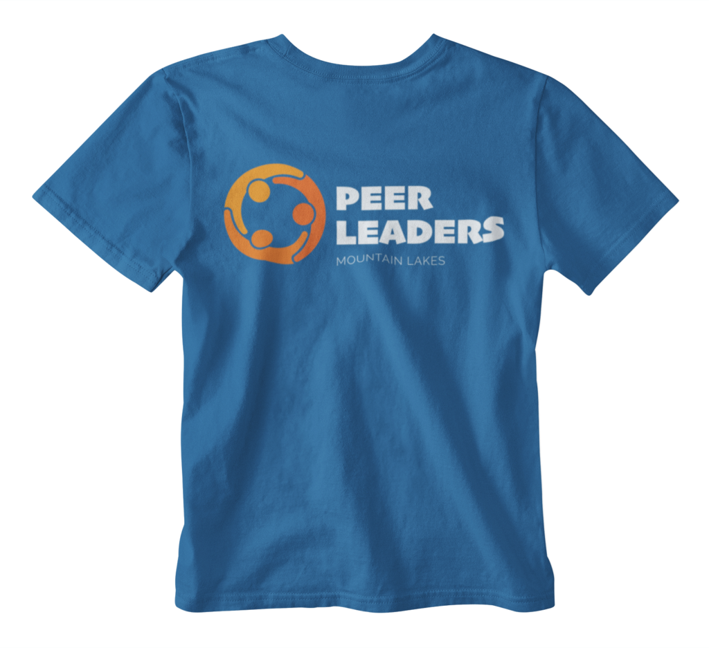
The new logo for the Peer Leaders of Mountain Lakes combines their school’s main color – orange – with a soft blue that compliments the orange’s vibrancy. The typography emotes character and is legible at all sizes. The icon – a group of individuals with their arms on each of their neighbor’s shoulders – resembles a gear which can be interpreted with many different meanings.
The design accomplishes many different characteristics of the Peer Leadership group. Along with it’s vibrant colors and unique visuals – it accomplishes everything the group was set out to capture.